Wednesday, August 19, 2009

Some bitter truth about the industry

Yesterday I saw this old thread in mattepaiting.org about interview of Hollywood illustrator/storyboard artist, Sylvain Despretz and interestingly Despretz himself had commented there few days ago. Go through the thread if you have time since it has some valuable information and different views, even Dylan Cole has his say (guess he was active in the forum almost 5 years back).

The more I think about these issues I feel it is notl ironic when someone says you need have a lot of luck or be at the right place at right time. Actually it matters a lot and God knows what holds for budding artists but anyway all one could do is just work your ass off and be persistent no matter what.

Here are few are quotes which I felt very interesting and insightful from his interview hosted at cgchannel.com
"You could say that most people are essentially interested in the Prestige of the movies that I worked on, more so than any objective notions of personal artistry, or drawings, but I guess you can’t ask too much of people."

"I have learned that Professionalism is often antithetical to Enthusiasm, but that when given a choice, it is also more reliable.

'I am a sort of Artistic Rent-A-Friend; “rent” being the operative word.'

"In music, after enjoying a Century of rich and heartfelt compositions in Contemporary Classical, Jazz, Big Band, Blues, Rock & Roll, all disciplines requiring a decent amount of Skillfulness, we are asked to accept Star-Puppets barking to walls of prerecorded sounds…They even have a new name for “ripping-off without crediting”: it’s now called “Sampling”.

There is an another article by Despretz called 'YOU WANT TO BE A HOLLYWOOD ARTIST?'. Even thought it is more based on illustrator/storyboard artist scenario, it still holds lot of things similar for other artistic trades in film industry. I really liked this article and here are few excerpts from it.
Is there a standard path to a career in film arts?
There is no path to a career in the film arts, or any kind of art, for that matter; this should be the first thing art schools ought to tell their students: "We haven't a clue; no one does". The problem for a student or young professional is three-fold:

a) Acquiring experience, to become competitive.
b) Making money just to live, in a way that remains at least on target.
c) Breaking into the "gated community" of show business.

I'm being offered a job today, but I want to hold out for a better one that promises to begin soon; what should I do?
This is a Jedi Mind Trick; the better job may manifest, sooner or later, but most likely, it won't. Common wisdom says that you might consider taking whatever job is in front of you - even if only for the time being. Look out for you; no one else does.
And here is my favorite one and believe me or not this happened to me already few times even in my short career span.
Will talking about money reflect negatively on me?
You bet it will!

You are expected to behave like Van Gogh.

The industrial world relies on Artistic low self-esteem for its survival. The hunched-back, Igor-like, image of the drooling Artist-Geek, chained to a drawing table, is a staple of our business. To complete that image, you need do nothing more than be ashamed of your need for money. People will be delighted.

Learn to identify the euphemisms of the trade:

"We want people who are excited about the project": We are looking for suckers.
"We would like to send you the script before we discuss money": We are looking for suckers.
"We want team players": We are looking for suckers.
"You are so talented": Are you a sucker?
"He's a trooper": He's a sucker.
"We getting a crop of young artists": We are looking for suckers.
"He's High Maintenance": He's figured us out.

Only then, can you identify the only sign that you are dealing with a professional outfit:
"Are you available; what is your rate?": We mean business!

Saturday, August 8, 2009

Ancestor of Vue or Fractcal Noise?

Vol Libre from Loren Carpenter on Vimeo.


I made this film in 1979-80 to accompany a SIGGRAPH paper on how to synthesize fractal geometry with a computer. It is the world's first fractal movie. It utilizes 8-10 different fractal generating algorithms. I used an antialiased version of this software to create the fractal planet in the Genesis Sequence of Star Trek 2, the Wrath of Khan. These frames were computed on a VAX-11/780 at about 20-40 minutes each.

Loren Carpenter
I think this is one of the most commonly used algorithm in 2D and 3D computer graphcis today. To know more about its humble beginings read Act II of Micheal Rubin's book driodMaker.

Monday, August 3, 2009

Cognitive use of color in films.

Today I read a very good article on cognitive use of color treatment in films by Isaac Botkin, the author of book called Outside Hollywood.

According to Botkin, 'Color can be used to communicate information to audiences in all kinds of ways. For example, the storyline in Steven Soderbergh’s Traffic takes place in three different places, each of which is a very different color. Viewers can instantly tell where characters are and what part of the story they are watching. This is a very obvious way to communicate basic information.' He also states that colors can be used to create an emotional state such as safety and danger by altering the mood from warm to cool colors.

It is interesting to note how different directors use colors differently, to explain this Botkin closely examine Ridely Scott's Black Hawk Down and how it bended the normal norms of color treatment. To read more on that check out Botkin's article Color Theory for Cinematographers.

Finally Butkin had posted color chart of the movie Black Hawk Down created by
Brendan Dawes.
(For more color charts check out Dawes's website)

Butkin states that if we look at right color gradient strip we can clearly see the film’s acts and turning points highlighted clearly. When I first vaguely read this article it reminded me of visual cognitive lessons I took back in my college. So Just to refresh my memory on this subject I read through some of my old notes and wrote my insights here as follows:

It is important to note that color is only one of the visual component the director has in his arsenal to alter the visual intensity of any shot. The visual intensity of the shot depends upon the intensity of the story structure and story structure is break down into basically four sections namely Exposition, Conflict, Climax and Resolution. Here is the graph which shows the story intensity at various levels of a story.
Here we can see the graph rising at the Exposition (EX) leading to Conflict (CO) then reaching its peak at the Climax (CX) and finally falls down to the Resolution (R). According to Bruce Block, the author of book called 'The Visual Story: Creating the Visual Structure of Film, TV and Digital Media' , all good stories follows this uphill structure.

I think this structure is very apparent if we look at the color gradient strip of Black Hawk Down, in which according to Butkin, cool colors suggest safety, warm colors suggest danger and finally green color suggest most intense part.

So once we understand the story structure we could use the visual components to get desired intensity. The author Block explains this in his book
using Principle of Contrast and Affinity which basically states, the greater the contrast in a visual component, the more the visual intensity. The greater the affinity in a visual component, the more the visual intensity decreases.

The other main visual components that can be used to create visual intensity are Line, shape, tone, color, movement and rhythm. Its beyond the scope of this post to go into detail of each of them but here are couple of screenshots from Block's book which explains these components graphically.
As a compositor/VFX artist, I strongly believe it is important to understand the story structure in order to alter the intensity of the shot according to director's vision. Since all of these visual components plays a important role in achieving a good composition which helps to sell the particular shot to audience.

Sunday, August 2, 2009

Rotoscoping Basics by Scott Squires

This is pretty old podcast but every time I watch it I learn something new so I thought I post here so that I could come back watch it again in future.


Don't forget to check out Scott Squires's great blog.
http://effectscorner.blogspot.com/

Sunday, July 19, 2009

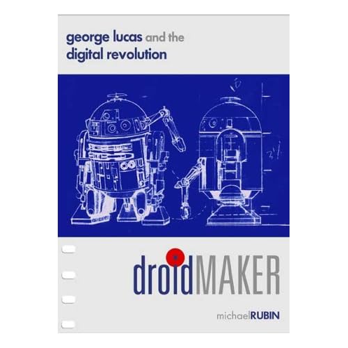
DROIDMAKER

I'm not really sure how this will go over, but i've decided to make my book DROIDMAKER downloadable in its entirety, effective today. It's a long book (518 pages), and I still recommend going to Amazon and getting yourself a copy (it's how you can pay for this "shareware"), but below are links to get PDFs of the book: I've divided it into the three "acts" that makes up the saga.

Thank you, and enjoy!
I just started reading this book and it gave me a really good insight into early career of George Lucas and Francis Coppola. It is a must read for any Lucas fan and It has a really good account of hardships he has gone through before getting where he is now.

I remember once my professor told me back in my college days, its easy to write about greatness of a person like Lucas but its hard to write about what methods or approaches he had used to achieve that greatness.

Download the book from Rubin's blog
http://droidmaker.blogspot.com/

Monday, July 13, 2009

'A pixel is not a little square' says Alvy Ray Smith

Its ironic that before reading this memo by Alvy Ray Smith I never wondered what really makes up a pixel. I always believed the computer stores color information as little squares but actually its only a mathematical representation of color information. Like Smith points out its mainly misconception due to the way computer application shows pixels when we magnify an image.

According to Smith,
'A pixel is a point sample. It exists only at a point. For a color picture, a pixel might actually contain three samples, one for each primary color contributing to the picture at the sampling point. We can still think of this as a point sample of a color. But we cannot think of a pixel as a square—or anything other than a point.'
He also states that an image is a continuous straight parallel array of point samples and by using an appropriate image reconstruction filter we could create full colorful image what out of it. It is interesting to note that for example, while using any of these filters they would represent array of point in a form of rectangle which can be almost similar to a square. I believe this is the reason why when we zoom on image we see square pixels which represents the main color value of points sample present in that particular area. Smith's explanation on the same as follows
when you zoom in is this: Each point sample is being replicated MxM times, for magnification factor M. When you look at an image consisting of MxM pixels all of the same color, guess what you see: A square of that solid color! It is not an accurate picture of the pixel below. It is a bunch of pixels approximating what you would see if a reconstruction with a box filter were performed. To do a true zoom requires a resampling operation and is much slower than a video card can comfortably support in realtime today.
I think today it is not really important to understand this very basic issue since it is something our today's image manipulation applications manage quite efficiently underneath the user interface. But at the same time understanding this basic issues may help us to understand other important techniques such as 4:2:2 color sampling which I discussed in my last post. The Bayer filter used in 4:2:2 digital image sensors of digital cameras are similar to an image reconstructions filters such as bilinear interpolation, bicubic interpolation and spline interpolation. They all build full color image from incomplete color samples (sample points) and this is process or algorithm is called demosaicing.

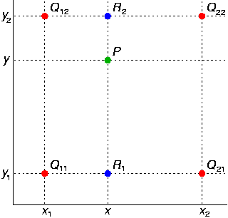
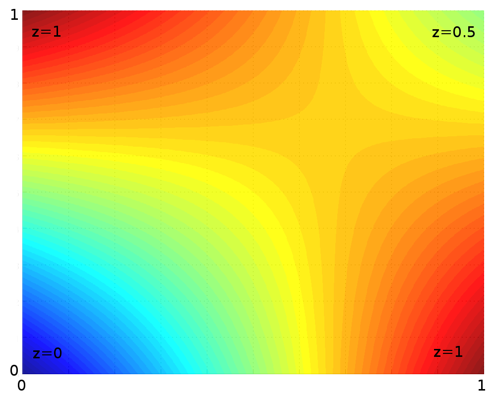
The below two images from wikipedia which explains this visually

The four red dots show the data points and the green dot is the point at which we want to interpolate.
Example of bilinear interpolation on the unit square with the z-values 0, 1, 1 and 0.5 as indicated. Interpolated values in between represented by colour.

Who is Alvy Ray Smith?
He was one of the cofounder of Pixar and also Executive Vice President from 1986-1991 and founder of Altamira which was acquired by Microsoft. He was co-awarded the Computer Graphics Achievement Award by SIGGRAPH in 1990 for "seminal contributions to computer paint systems," including the first full-color paint program, the first soft-edged fill program, and the HSV (aka HSB) color space model.

Most interestingly he gave Pixar its name which meant "to make pictures", an invented Spanish verb meaning. Also while at Pixar he played an important role in hiring John Lasseter who is now the CCO at Pixar and Walt Disney Animation Studios.

Finally check out the Pixar founding documents hosted in his website.

Cheers,
Rahul


Sunday, July 5, 2009

Truth about resolution and pixels

Last week our team had a presentation on RED workflow from good people at Icerberg Design here in Singapore. The key issues we discussed at the end were 4:2:2 color sampling and advantage of 10 bit log space of RED workflow. While advantage of 10 bit log space is almost similar to a film workflow but the compromise we would make would be on the quality of the image.

Is RED 4K really 4K? There is a really good interview of John Galt, Panavision Senior Vice President, Advanced Digital Imaging at creativecow.net and here from few good quotes from the interview.

Any of the high-end high definition video cameras, they had 3 sensors: one 1 red, a green and a blue photosite to create 1 RGB pixel.

But what we have seen particularly with these Bayer pattern cameras is that they are basically sub-sampled chroma cameras. In other words they have half the number of color pixels as they do luminance And the luminance is what they call green typically. So what happens is you have two green photo sites for every red and blue.

So how do get RGB out of that? What do you have to do is, you have to interpolate the red and the blues to match the greens. So you are basically creating, interpolating, what wasn't there, you're imagining what it is, what its going to be. Thats essentially what it is. You can do this extremely well, particularly if the green response is very broad.

Well 4K in the world of the professionals who do this, and you say “4K,” it means you have 4096 red, 4096 green and 4096 blue photo sites.

I dug a bit deep into this subject and though I felt it was too technical but I got some good insight on this subject.

To really understand this issue first we must take a look at what really defines quality of the image. A common misconception is that resolutions increases the sharpness of the image but in reality the fine details are mostly irrelevant to human eye,
though human eye is capable of reading extremely fine details. This is also true at greater distance and what really defines the sharpness of the image are the contour defining features at a higher contrast. It is important to note that above statement doesn't mean a low resolution image with high contrast will give better viewing experience since it could lead to aliasing issues.

Since resolution and sharpness are completely separate terms, we establish relationship between them using MTF
(Modulation Transfer Function). So each time when generation loss happens during transfer of medium we define it using MTF.

There is a lot more to read and understand on this subject. A good start on that would be the main source of information of what I have written here, an article called 4K systems by Dr. Hans Keining, R&D Depth ARRI .

To conclude, counting pixels wouldn't be the best way to judge quality of an image and the quality of an image depends upon lot of attributes. The MTF just doesn't start at post production, for example there are modulation happening within the camera during the capturing process. So it is really important to take a closer study at these issues separately.

Coming back to the RED discussion, I believe RED's subsampled 4K image would be slightly advantageous even in HD or SD (based on a broadcast scenario) production since MTF would be comparatively lesser compare to a normal 4:2:2 color sampled HD camera.

Cheers,
Rahul