Raysinblue
Tuesday, October 20, 2015
Sunday, August 9, 2015
Saturday, June 6, 2015
Wednesday, April 29, 2015
Fjords matte painting breakdown
This post is going to be the first one in the series of breakdown / tutorials that I would be doing here in my blog. The purpose is to share my technique and thoughts process behind these personal projects.
Inspiration
My main source inspiration for this piece came from the The History channel series 'The Vikings'. I was really captivated by splendid scale of the fjords and I really wanted to capture sense of that vastness in the landscape.
As you can see sense of scale of these mountains are quite breathtaking and I wanted that to be the main focal point of this matte painting. I also took some color cues from the second screenshot. I really liked the earthly tones in the palette and I wanted to go for the same balance but with more warmer tones.
Conceptualization
I started with a very loose value sketch blocking out my composition, scale and shapes. At this point, I wasn't sure about the final direction as I was still exploring different variations in scale and shapes. I wasn't keen on putting any details here as all of this will be replaced by different textures I would use from my photo references. It is a good idea to establish your light direction at this stage so it helps while you look for your photo references which you may use as textures to fill these shapes.
Photo References
This is most important part of digital matte painting and it might take lot of your time finding the right photos which can act as your textures. I always approach this from a set extension point of view. By that I mean, I will find a hero reference plate (photo) and use that as my main element and work my way from there. I think this method is very useful because most of the times in a production environment you would end up matching all your elements / textures to a particular shot plate (footage).
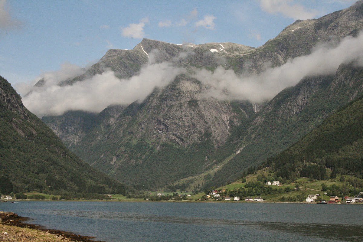
Hero plate

I really liked the sense of scale this photo and the clouds had a very surreal feel to it. And here is a collage of other main references I use for this matte painting.
Please note that I do not own copyrights for any of these images but I have made sure I have used them in a way that it is no longer fully or partially resembles it's original form. And since this is a non-commercial personal project I believe I am on the safe side. When you work on a commercial project, please do double check the copyrights of your photo references or make sure you use them as textures and make it unrecognizable.
Photo Collage and Image manipulation
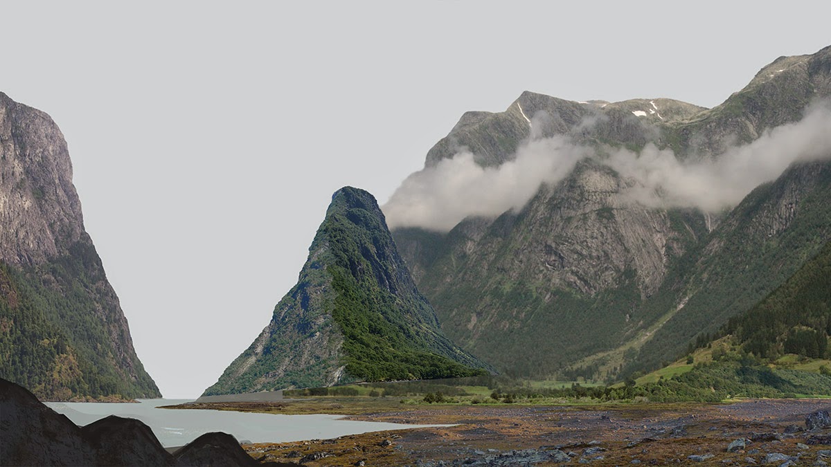
I started building the matte painting by deriving different photo elements from the references I collected from Google Images and I used them as textures to fill up my concept sketch. It is very crucial to note that you have to keep the sense of scale, linear perspective and lighting uniform during this process.
At this stage, I realized I was not happy with the scale I was going after and I wanted to keep my matte painting close to photo realism so I decided to make minor changes to my initial concept sketch
As you can see now the composition is more relaxed and balanced. With most of my personal projects I keep experimenting with composition until the last moment. I don't get this luxury when I do freelance work or when I am on a contract job.
Above you can see, I brought in more rock elements for the foreground and I arranged them in such a way that it helps to lead the viewer's eye to my hero mountain. I made sure my rock elements were fitting into the scale and perspective. The most challenging aspect of this matte painting was getting scale right with all the elements.
Here is the final photo montage with sky and water. I usually work on the sky first as it plays huge role in defining the lighting of the scene but in this case I knew the kind of cloudy sky I was going after with hints of directional lighting so the sky came a bit late in the process.
Color balancing and lighting
Using adjustment layers, I have non-destructively color corrected all the layers to neutrally balance their colors to the main hero element. The step below is where I have spent most of my time in this matte painting. I have used adjustment layers and hand painting techniques to add lighting, shadows and better integration for the elements. Below you can see I have moved towards more earthly color tones matching to my inspiration references.
Atmosphere, Lighting and Finishing
In the final stage I have worked more on the atmosphere, lighting and refining the elements especially on the foreground. I would say the most time consuming process was the beginning and finishing stage since I have to finalize and make decisions on every minute details.
I hope you enjoyed the breakdown, please feel free to comment here or ask any questions.
Cheers,
Rahul
Inspiration
My main source inspiration for this piece came from the The History channel series 'The Vikings'. I was really captivated by splendid scale of the fjords and I really wanted to capture sense of that vastness in the landscape.
As you can see sense of scale of these mountains are quite breathtaking and I wanted that to be the main focal point of this matte painting. I also took some color cues from the second screenshot. I really liked the earthly tones in the palette and I wanted to go for the same balance but with more warmer tones.
Conceptualization
I started with a very loose value sketch blocking out my composition, scale and shapes. At this point, I wasn't sure about the final direction as I was still exploring different variations in scale and shapes. I wasn't keen on putting any details here as all of this will be replaced by different textures I would use from my photo references. It is a good idea to establish your light direction at this stage so it helps while you look for your photo references which you may use as textures to fill these shapes.
Photo References
This is most important part of digital matte painting and it might take lot of your time finding the right photos which can act as your textures. I always approach this from a set extension point of view. By that I mean, I will find a hero reference plate (photo) and use that as my main element and work my way from there. I think this method is very useful because most of the times in a production environment you would end up matching all your elements / textures to a particular shot plate (footage).
Hero plate

I really liked the sense of scale this photo and the clouds had a very surreal feel to it. And here is a collage of other main references I use for this matte painting.
Please note that I do not own copyrights for any of these images but I have made sure I have used them in a way that it is no longer fully or partially resembles it's original form. And since this is a non-commercial personal project I believe I am on the safe side. When you work on a commercial project, please do double check the copyrights of your photo references or make sure you use them as textures and make it unrecognizable.
Photo Collage and Image manipulation
I started building the matte painting by deriving different photo elements from the references I collected from Google Images and I used them as textures to fill up my concept sketch. It is very crucial to note that you have to keep the sense of scale, linear perspective and lighting uniform during this process.
At this stage, I realized I was not happy with the scale I was going after and I wanted to keep my matte painting close to photo realism so I decided to make minor changes to my initial concept sketch
As you can see now the composition is more relaxed and balanced. With most of my personal projects I keep experimenting with composition until the last moment. I don't get this luxury when I do freelance work or when I am on a contract job.
Above you can see, I brought in more rock elements for the foreground and I arranged them in such a way that it helps to lead the viewer's eye to my hero mountain. I made sure my rock elements were fitting into the scale and perspective. The most challenging aspect of this matte painting was getting scale right with all the elements.
Here is the final photo montage with sky and water. I usually work on the sky first as it plays huge role in defining the lighting of the scene but in this case I knew the kind of cloudy sky I was going after with hints of directional lighting so the sky came a bit late in the process.
Color balancing and lighting
Using adjustment layers, I have non-destructively color corrected all the layers to neutrally balance their colors to the main hero element. The step below is where I have spent most of my time in this matte painting. I have used adjustment layers and hand painting techniques to add lighting, shadows and better integration for the elements. Below you can see I have moved towards more earthly color tones matching to my inspiration references.
Atmosphere, Lighting and Finishing
In the final stage I have worked more on the atmosphere, lighting and refining the elements especially on the foreground. I would say the most time consuming process was the beginning and finishing stage since I have to finalize and make decisions on every minute details.
I hope you enjoyed the breakdown, please feel free to comment here or ask any questions.
Cheers,
Rahul
Sunday, February 8, 2015
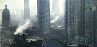
Vancouver
I moved to Vancouver last month and started working here at MPC as a Digital Matte Painter. It's been a great experience so far and I really look forward to learn from the amazing pack of artists here.
This week I also noticed REDHOT VFX has posted a glimpse of what I worked for them during last year, you can check out the video here and here is couple of screenshots.
DMP
Final Comp
This week I also noticed REDHOT VFX has posted a glimpse of what I worked for them during last year, you can check out the video here and here is couple of screenshots.
DMP
Final Comp
Saturday, December 20, 2014
Saturday, September 27, 2014
Subscribe to:
Comments (Atom)


